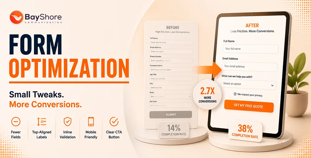
A/B Testing Your CTA Buttons: What Colors, Phrasings, and Placements Work Best

We spend a lot of our days at Bayshore Communication watching how people move through a screen. We notice how eyes drift over a headline, how a thumb pauses for a breath, and how someone chooses to click or slip away. When we talk with clients across Florida, we remind them that a button is a request and a small invitation that holds the weight of the page. This is why we test everything. Color, copy, placement, shape, and timing. When one detail moves, the result moves with it.
We built this guide to show how we study CTAs from the inside. What follows comes from real work, real tests, and a steady belief that simple ideas usually carry farther than complicated ones.
1) Why CTA buttons matter more than most brands realize
A CTA button is where every page announces its purpose. If you want someone to join, buy, book, sign up, or start a trial, it all flows into one small space. We see brands pour enormous energy into headlines and beautiful design, only to treat the button like an afterthought. That is where opportunities slip away.
A button does not work because it is loud; it works because it is clear. It works because the user knows what will happen the moment they tap or click. It works because the surrounding story leads naturally into the action you want. Everything else is decoration.
2) What is the real secret behind CTAs that actually get clicked?
People respond to clarity. That is the secret. Not cleverness. Not a dramatic color. Not pressure. Clarity works because it creates calm. It gives someone the confidence to act without thinking twice.
When we craft CTAs for our clients, we ask ourselves a simple question: would a tired person at the end of a long day understand what this button does? If the answer is no, we fix it. Forbes has reported similar patterns, noting that simple CTAs consistently outperform ambiguous ones in high traffic environments.
A clear CTA usually has three qualities.
A direct verb.
A simple promise.
A natural place on the page.
If those three are present, the button has a fair chance, otherwise everything feels forced.
3) Which CTA button text color is better?

There is no universal winner. We have seen tropical orange crush conversions for one brand, while a deep blue beats everything for another. Color works in context. It plays with contrast, background, brand identity, and emotion.
When we test color, we look at how it behaves inside the layout instead of chasing color trends. We focus on one rule: the button must stand out without looking loud. A bright color that feels random can break trust. A soft color with strong contrast can carry the whole page.
Here is how we usually judge whether a color is worth testing.
Does it contrast clearly with the background?
Does it fit the brand without blending into the page?
Does the text stay readable for all users, including those with low vision?
If the answers lean yes, we test it. If anything feels unclear, we keep searching.
4) How can you A/B test different color CTAs on your site?
A good test starts small. If you change too many things at once, you lose the trail. We treat A/B tests like small experiments that help us understand behavior rather than prove anyone right or wrong.
Here is the simple approach we use.
Pick one variable. In this case, button color.
Pick one goal. For example, increase signups or increase clicks.
Write a hypothesis that feels honest.
Run the test long enough for real traffic to settle into a pattern.
Check performance by device, since mobile often behaves differently.
5) What is the best secret in designing CTA buttons?
The best secret is building a button that requires no thinking. The less someone has to interpret, the smoother the click. That simplicity comes from details like spacing, clean edges, readable type, and a small bit of microcopy that supports the button without crowding it.
A good CTA feels like a continuation of the sentence before it. A bad one feels like a stranger who showed up uninvited.
6) What is the role of CTA buttons in terms of form design?
A form is already a small test of patience. The CTA at the end of it should give a sense of closure. It should feel final, clear, and reassuring. If the button feels vague, people hesitate. If it looks uncertain, they pause. That pause is where drop-offs happen.
When we work on form CTAs, we pay attention to momentum. The button needs to feel like the last step, not another obstacle. So we avoid friction. We avoid long labels. We avoid anything that suggests extra hurdles.
Good-form CTAs share a simple spirit.
They confirm what the user is about to do.
They signal safety and completion.
They work well under pressure when someone is tired or in a hurry.
7) How do you create compelling calls to action in digital marketing?
 How do you create compelling calls to action in digital marketing_")
Compelling CTAs in digital marketing come from understanding the moment your user is in. We never choose wording without thinking about the emotional state of the reader. Are they curious? Skeptical. Rushed. Comparison shopping. It all matters.
Once we understand the moment, we shape the CTA around a gentle push forward. Strong action verbs help; however, the real persuasion sits in the value. People want to know what they get. People want to know what they avoid.
Some examples of value-first phrasing include:
Get my free guide
Start my trial
Book my session
See my options
Save my spot
8) What specific process do we have for selecting a CTA, and how does it perform across market environments?
First, we look at audience intent. Then we match the CTA to the goal of the page. After that, we test variations that change only one small detail at a time. Once the test runs long enough, we study how different segments behave.
The World Bank’s digital adoption data shows that mobile first behavior continues to rise across global markets, which makes mobile CTA testing essential. Mobile users respond one way. Desktop users respond differently. New visitors and returning visitors show different instincts.
Market environments shift too. During busy seasons, people click more quickly. During slow seasons, they hesitate. The Economist emphasizes how consumer decision speed rises during peak seasons and slows when economic uncertainty grows, which influences how users respond to CTAs. A good CTA adapts to these shifts without losing clarity.
10) How do you approach CTA design to encourage interaction and drive outcomes?
The page needs to lead the user to one natural pause, and that pause should be the button. When the user reaches it, the next step should feel obvious.
To encourage interaction, we rely on simple tools.
Whitespace that opens the space around the button.
A color that pulls the eye without overpowering the story.
Surrounding text that sets up the action naturally.
11) What are the best practices for CTA button size and placement?
Size matters because comfort matters. A tiny button can feel annoying. A giant one can feel pushy. We look for a balance that feels natural on every screen.
Placement depends on the story of the page. Early CTAs work well when the offer is simple. Later CTAs help when the reader needs context or trust before acting. On long pages, we repeat CTAs so the user never has to scroll back up.
A few placement habits we trust:
A visible CTA above the fold for quick movers.
A second CTA after benefits or testimonials.
A final CTA at the bottom of long pages..
12) Which small design choices make the biggest difference in CTA performance?
Small details in UI design create surprising results. A rounded corner can soften the feeling of a button. A small arrow can push the eye forward. A testimonial nearby can reduce hesitation. Even subtle shadowing can make a button feel touchable.
Some little choices we watch closely:
Font weight.
Button height.
Microcopy beneath the CTA.
Slight animation on hover.
Spacing between the CTA and surrounding text.
13) How to run a clean A/B test without compromising your results

The biggest enemy of A/B testing is impatience. We have seen countless tests stopped too early. A test needs time to settle into a pattern. It needs weekday traffic and weekend traffic. It needs a full cycle of natural behavior.
To keep results clean, we stay disciplined.
Change one thing at a time.
Resist the urge to judge too early.
Check your tracking before running the test.
Compare devices separately.
FAQ
How much CTA performance is considered very good
There is no single number. It depends on traffic quality, the difficulty of the action, and the design of the page. We judge performance by improvement rather than comparison. A meaningful lift is always a win.
Which is the better CTA for increasing subscriptions
The better CTA is usually the one that names the value. People respond to clarity, not mystery. Buttons that start with a direct verb and mention the benefit tend to outperform generic ones.
Should the text on CTAs be bold
Bold text helps when the background is busy or the button color is soft. If the design already has strong contrast, normal weight can feel cleaner. We tested both.
Bayshore Communication’s Final Take
Working with CTAs reminds us that small choices carry real weight. A single pixel change can shift a user’s path. A single word can open the door or close it. When we treat CTAs as living parts of a page rather than static elements, they start to do real work.
We build buttons the way we build stories at Bayshore Communication. With patience, curiosity, and a steady respect for how people move. The click is never the goal by itself. The click is the proof that the story made sense.
If you want the writing polished into web-ready formatting, we can structure it cleanly for publishing.