CTA Optimization | Conversion Strategy
A data-driven guide to CTA optimization for teams that want more visitors to become qualified leads.
Optimizing your call-to-action buttons can help boost conversion rates. When you refine button text, improve button visuals, and test placements, you make it easier to turn browsers into buyers. For broader planning, connect the CTA work with your digital marketing strategy.
Quick Takeaways
Users decide if they want to click a button in less than half a second.
Using "My" instead of "Your" can make CTA copy feel more personal and increase engagement.
Visual isolation and contrast usually matter more than the button color alone.
High-value content should lead the CTA, regardless of the fold.
Desktop and mobile layouts need different CTA approaches to stay usable.
Track full-funnel conversions instead of only measuring button clicks.
< 500ms
Micro-decision window to grab user attention
90%
Conversion lift reported from "My" vs. "Your" CTA copy
20-30%
Clickability boost from subtle gradients or shadows
The Psychology Behind High-Converting CTA Buttons
Your button is not just a design element. It is a psychological trigger. You need to understand the mental shortcuts users take in the first few hundred milliseconds. That is the first step toward turning a passive visitor into an active lead.
How User Motivation Affects Button Click Decisions
To get conversions, your design needs to grab users during a very short micro-decision window. If users do not see a benefit right away, they keep scrolling or leave. Button text and style should match what the user wants now, so the next step feels obvious.
Why Emotional Response Triggers Clicking Action
The most effective CTAs combine emotional urgency with clear functional benefits. A bookkeeping service should not settle for “Submit.” A better CTA is “Secure My Tax Savings” because it explains the outcome and creates a personal stake.
People buy based on emotion and justify with logic. Your CTA is the emotional hook that pulls them into the justification phase.
Writing Compelling CTA Copy to Boost Conversion Rates
Design gets noticed first, but words make people act. Action oriented copy tells users what they get after clicking and reduces uncertainty.
Use Action-Oriented Language
Generic labels like “Click Here” or “Submit” offer no value. If you have a gift service, “Send My Gift Box” is stronger than “Continue” because it tells the user what to expect.
Move From Sterile Text to Persuasive Triggers
First-person framing, such as “My” or “I,” helps users mentally claim the benefit. Changing “Start your trial” to “Start my trial” makes the CTA feel like an invitation to take control.
Enhancing CTA Design Through Visual Hierarchy
Even strong copy can fail if the button does not stand out. Color contrast and whitespace guide the user’s eye toward the action.
Master Contrast and Whitespace
Visual isolation is often more effective than color psychology alone. If your layout is busy, whitespace frames the CTA and signals that it is the page priority.
Use Shape and Dimension to Signal Clickability
Button size and shape affect decisions by reducing cognitive load and improving accessibility. Rounded rectangles, clear dimensions, and subtle shadows help users recognize that an element is clickable.
Ready to Turn Visitors Into Clients?
Need help figuring out why people visit your website but do not convert? Talk with Bayshore Communication about conversion-focused design, content, and campaign strategy.
Contact Bayshore Communication TodayOptimizing CTA Placement for Maximum Visibility
A high-converting CTA is useless if it appears where the user is not ready to act. Contextual placement, after the value proposition, often beats the old “above the fold” rule for complex service offers.
Content Context Beats Button Position
Relevance drives the click. For professional services, users often need to read the benefits before they are ready to schedule a consultation. This is why CTA placement should work with your content marketing flow.
Align Positioning With Scanning Behavior
Many readers scan pages in an F-pattern. Placing CTAs where the eye naturally lands after the value statement reduces effort and helps turn a glance into engagement.
Device-Specific CTA Optimization
Desktop layouts can support hover effects and secondary options. Mobile layouts need thumb-friendly targets, compact forms, and clear spacing.
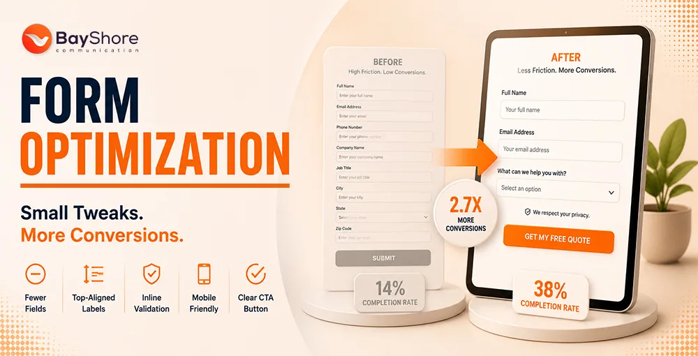
Without Optimization
- Generic text like "Submit" or "Click Here"
- No visual isolation or contrast for the CTA
- CTA placed above content before value is clear
- Same layout on desktop and mobile
- Tracking only clicks, not full-funnel conversions
With Bayshore Optimization
- Action-specific copy like "Secure My Tax Savings"
- High-contrast button with a whitespace frame
- CTA placed after the value proposition
- Device-specific layouts with thumb-friendly targets
- A/B testing tracked to actual revenue and leads
Measuring the Effectiveness of Your CTA Buttons
Optimization is ongoing. Measure more than click volume. Track actual leads, sign-ups, and revenue to prove that CTA improvements are growing the business.
Scale Performance Through A/B Testing
Test one change at a time, such as button copy, placement, color, or size. This keeps your decisions grounded in real user behavior instead of guesswork.
Use Heat Maps and Feedback
Heat maps show what users do. Feedback explains why they do it. If a button has high impressions but low clicks, surveys may reveal that users do not understand the offer or find the layout confusing.
Step-by-Step CTA Optimization
Audit Your Current Buttons
Review existing CTA text, placement, and design. Note every generic phrase like "Submit" or "Click Here."
Rewrite for Action and Ownership
Replace generic text with first-person, benefit-specific copy. Use "My" to create psychological ownership.
Apply Visual Hierarchy
Add whitespace around the button, keep strong color contrast, and use button shapes that clearly look clickable.
Align Placement with Content Flow
Move CTAs after the value proposition. Match placement to scanning behavior and adapt for desktop and mobile separately.
Run A/B Tests and Track Full-Funnel
Test one change at a time. Measure real conversions, leads, and revenue, not just clicks.
Frequently Asked Questions
Should I use multiple CTA buttons on one page?
Use one primary CTA. Secondary buttons can support lower-priority actions, but they should look distinct from the main CTA.
What is the best color for a CTA button?
There is no universal best color. The best color is the one that contrasts clearly with your page and stands out to the user.
How do I make my CTA accessible?
Use high color contrast, make the target large enough for mobile taps, and ensure the button works with keyboard navigation.
Does button size affect conversion rates?
Yes. A button should be large enough to notice and tap, but not so large that it disrupts the page layout.
Final Thoughts
Even small changes to your CTA copy, visual hierarchy, and placement can influence revenue. Start with a clean audit, connect CTA changes with your website experience, and keep testing against real business outcomes.