Mobile Web Design | Responsive UX & SEO Guide
Mobile website design is the process of developing a website that provides a seamless, high performing browsing experience on smartphones and tablets. Since mobile traffic has consistently surpassed 50% of global web traffic, there’s every reason to have a mobile-first design strategy. Rather than squishing a desktop view, modern mobile design is about context, touch, and content verticality done right.
Key Takeaways
Modern mobile web experiences require speed, adaptability, and effortless usability. Keep these core principles front and center:
Mobile design aids website navigation. Developers increase page speed.
Responsive layouts fit diverse screen sizes.
Fast performance shapes the user experience.
Google primarily uses mobile content for indexing.
Simple menus enhance site navigation.
Engineers test varied devices. Specialists check different web browsers.
1.What Is Mobile Website Design And How Does It Work?
Mobile design builds adaptive pages. The layout matches screen space. Text adjusts font size. Images scale display widths. Buttons resize touch areas. Menus reorder navigation options. Responsive design dominates industry practices. Flexible grids use CSS code. One website can then support multiple screen sizes.
A good mobile website should provide:
- Easy navigation
- Readable text
- Fast loading
- Responsive layouts
- Touch-friendly buttons
- Simple forms
- Optimized images
- Clear calls to action
The goal is simple. Your visitor should understand the page quickly. They should also complete their intended action easily.
2.Why Is Mobile Website Design Important For Your Business?
Mobile design impacts usability. Layouts affect search visibility. Design drives conversions. Poor experiences repel visitors. A strong experience can make important actions easier.
Think about your own visitors. Do they search for your services while traveling? Do they compare businesses from their phones? Do they contact you through mobile devices? Mobile design impacts your business.
Google endorses responsive web design. Responsive layouts simplify content maintenance. This approach ensures uniform user experiences across phones, tablets, laptops, and desktops.
3.How Does Mobile Website Design Affect SEO?
Mobile usability lifts SEO results. Strong usability aids rankings. Fast performance aids SEO. Google primarily uses mobile versions for indexing through its mobile-first indexing architecture. Your mobile content should therefore contain important information. Mobile SEO also involves page experience.
Important areas include:
- Mobile usability
- Page loading performance
- Content accessibility
- Internal linking
- Metadata
- Structured data
- Responsive layouts
Your desktop website may look perfect. However, problems can remain on mobile. For example, small text can hurt readability. Difficult menus can hurt navigation. Slow pages can increase visitor frustration. Therefore, test every important page on mobile devices.
4.What Makes A Mobile Website Easy To Use?
A mobile website should remove unnecessary friction. Visitors should find important information quickly. Buttons should also be easy to tap.
Start with simple navigation. Your menu should show important sections clearly. Your text should also remain readable. Avoid forcing users to zoom. Use comfortable spacing between elements.
Forms need special attention. Smaller screens make long forms difficult. Keep forms short whenever possible. Ask only for necessary information. Your calls to action should also stand out.
Examples include:
- Book An Appointment
- Request A Quote
- Call Us Today
- Get Started
Clear actions help visitors move forward without friction or hesitation.
5.How Fast Should A Mobile Website Load?
Mobile websites require rapid loading speeds. Faster pages generally create a better user experience. Performance also contributes to Google's page experience systems.
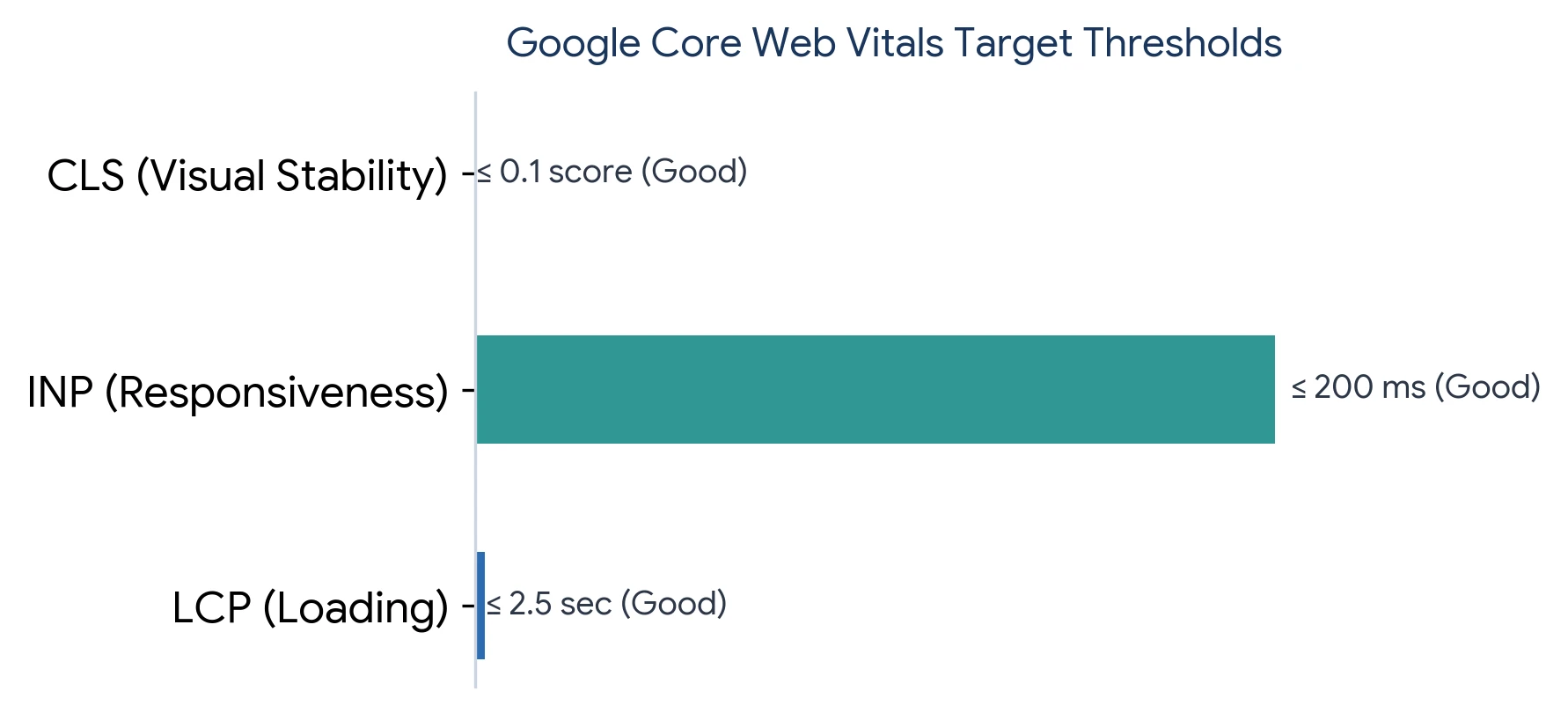
Google's Core Web Vitals measure several user experience signals. These include loading, responsiveness, and visual stability.
The current Core Web Vitals include:
- Largest Contentful Paint (LCP): Measures loading performance. A good user experience requires LCP to occur within 2.5 seconds of when the page first starts loading.
- Interaction to Next Paint (INP): Measures interaction responsiveness. Pages should maintain an INP of 200 milliseconds or less to ensure fast touch and click responses.
- Cumulative Layout Shift (CLS): Measures visual stability. Sites should strive to keep a CLS score of 0.1 or less so page content doesn't shift unexpectedly.
Each metric measures a different experience. LCP measures loading performance. INP measures interaction responsiveness. CLS measures visual stability. You should monitor these metrics regularly. A beautiful website still needs strong performance.
6.How Can You Improve Mobile Website Speed?
Mobile performance requires both design and technical improvements. Large files are common causes of slow pages.
Start by optimizing your images. Use suitable image formats and dimensions. Avoid uploading unnecessarily large images. You can also reduce unnecessary scripts. Remove plugins that provide little value.
Other detailed performance speed tactics include:
- Browser caching – Stores files locally for faster repeat visits.
- Content delivery networks – Delivers content from servers closer to users.
- Code optimization – Removes unnecessary code to improve loading speed.
- Image compression – Reduces image file sizes without significant quality loss.
- Lazy loading – Loads images and content only when they’re needed.
Google's PageSpeed Insights identifies issues. It provides performance measurements for individual pages. Test important pages regularly.
Speed, Usability & Conversion Optimization
Ready to Optimize Your Mobile Performance?
Let Bayshore Communication audit your mobile website speed, usability, and rankings.
7.What Is Responsive Mobile Website Design?
Responsive design allows one website to adapt automatically to different screen sizes and devices. Responsive designs fit every screen by adjusting layouts, spacing, navigation, and content. Sites adjust for phones. Layouts adapt for tablets. Elements can stack vertically on smaller screens, while wider screens can display multiple columns.
Grids resize for desktops and smaller devices. Flexible grids power responsive websites by using relative widths instead of fixed dimensions. They also use flexible images that scale within their containers and CSS media queries that apply different styles based on screen size. Breakpoints help layouts change when the available screen width requires a different arrangement.
Responsive design also follows practical rules for usability. Text should remain readable without excessive zooming. Buttons and links should have enough space for touch interaction. Images should scale without overflowing their containers. Navigation should remain easy to access on smaller screens. Content should fit the viewport without requiring horizontal scrolling.
This approach has several benefits. You maintain one website instead of separate versions. Updates become easier to manage. SEO management also becomes simpler. Google recommends responsive web design. It is also the easiest configuration for Google to understand. Most businesses need responsive websites.
8.Mobile-First Design Starts With The Smallest Screen
Mobile-first indexing means Google primarily uses the mobile version of a website’s content for indexing and ranking. Your mobile page should therefore contain the same important content, structured data, images, and metadata as the desktop version.
Mobile-first design starts with mobile requirements. Designers then expand the experience for larger screens.
Why does this approach help? Small screens force you to prioritize important content. You cannot hide poor structure behind extra space.
Start with your essential elements. Ask what visitors need first. Then remove unnecessary distractions. Afterward, expand the layout for tablets. Finally, adapt it for desktop screens. This approach often creates cleaner websites. It also supports better content hierarchy.
How Should Mobile Navigation Be Designed?
Mobile navigation should remain simple and predictable. Visitors should understand where they are. They should also reach important pages quickly.
Many websites use a hamburger menu. This keeps navigation compact on smaller screens. However, your menu still needs clear labels. Avoid vague terms such as “Explore.” Use descriptive labels instead.
For example:
- Services
- About Us
- Pricing
- Resources
- Contact
You should also keep important actions visible. A prominent contact or booking button can help.
How Should Buttons Work On Mobile Websites?
Mobile buttons need enough space for touch interaction. Small buttons can cause accidental clicks. Closely spaced links can create similar problems.
Use clear button labels. “Submit” gives less context than “Request A Quote.” “Learn More” can also be less useful. Tell users what happens next.
Your button placement matters too. Put important actions near relevant information. Repeat them when long pages require it. Avoid excessive calls to action. Too many choices can create confusion.
9.How Does Mobile Website Design Affect Conversions?
Mobile design can make conversions easier. Visitors should complete important actions with minimal effort.
Consider your primary conversion. Do you want phone calls? Do you want form submissions? Do you want purchases? Design the page around that action.
For example, a service business may prioritize calls. An e-commerce store may prioritize purchases. A lead-generation website may prioritize forms. Your mobile design should support that goal. Remove unnecessary steps wherever possible. Make the next action obvious.
10.What Common Mobile Website Design Mistakes Should You Avoid?
Many mobile problems come from desktop-first thinking. A desktop layout does not always translate well.
Common mistakes include:
These problems can frustrate visitors quickly. You should also avoid hiding important content. Google recommends keeping equivalent primary content across devices. Mobile pages should not remove important information found elsewhere. Users value consistency. Search engines reward consistency.
11.How Much Does Mobile Website Design Cost?
Mobile website design costs vary by project scope. A simple responsive site costs less than custom development. E-commerce and web applications usually require larger budgets.
Typical market ranges can look like this:
These figures vary by provider and requirements. The most useful step is defining your scope first.
12.How Can You Test A Mobile Website Before Launch?
Testing should cover different devices and screen sizes. Do not test only one phone. Check your website using both Android and iOS devices. Test common browsers as well.
Review every important interaction.
Your testing checklist should include:
- Open every main page.
- Test the navigation menu.
- Submit every important form.
- Test buttons and links.
- Check image loading.
- Test page speed.
- Check text readability.
- Test different screen sizes.
Also test real-world conditions. Try the website using mobile data. Test slower connections when possible. Your website should remain usable outside ideal conditions.
13.How Should Beginners Approach Mobile Website Design?
Beginners should focus on usability first. You do not need complicated features immediately.
Start with responsive layouts. Then create simple navigation and readable content. Next, optimize images and page speed. Finally, test important actions.
Do not add features simply because they look impressive. Ask one question instead. Does this feature help your visitor? If the answer is unclear, reconsider it. Simple websites can perform very well.
14.What Should Advanced Businesses Focus On?
Advanced businesses should focus on performance and conversion optimization. They should also analyze user behavior across devices.
Use analytics to identify mobile problems. Look for pages with high exit rates. Review pages with weak conversion rates. Then test improvements.
Advanced websites can also use personalization. They may integrate search, payments, customer systems, or applications. However, complexity should support business goals. Technology must ease user tasks.
15.Is Mobile Website Design The Same As A Mobile App?
No, mobile apps fulfill separate needs. Each tool serves different goals. A mobile website runs through a browser. A mobile app requires installation. A website offers easier access. Users can open it directly through search. They do not need an installation first.
Apps can provide deeper device integration. They can also support specialized experiences. Most businesses should start with a strong mobile website. An app becomes useful when its features justify development.
16.Why Should Your Website Be Designed For Mobile First?
Mobile-first design matches mobile browsing habits. It also forces businesses to prioritize essential information. A mobile-first website can improve consistency. It can also simplify development and testing.
Google's mobile-first indexing makes this even more important. Google primarily evaluates the mobile version for indexing. Therefore, your mobile website should contain complete content. Do not treat mobile as a smaller desktop version.
Conclusion
Your mobile website is often your first digital interaction. We can help you make that interaction simple and useful.
BayShore Communication creates clear website experiences. We build responsive sites for all devices. Our team prioritizes usability. We refine site content. We boost page speed. Our designs meet business goals.
We do not believe mobile design should add unnecessary complexity. We focus on what your visitors actually need.
We build beautiful websites. We ensure effortless usability. Our team serves your website goals.
Mobile-First Web Development
Build A Mobile Website That Works For Your Business
Let's build a mobile website that helps your business grow. Contact Bayshore Communication today.
Frequently Asked Questions
Questions People Usually Ask Us About Mobile Website Design
Q. What Is Mobile Website Design?
Mobile design optimizes smartphone websites. Layouts fit small screens. Pages display readable content. Buttons enable touch controls. Fast speeds improve loading. Simple menus guide visitors.
Q. Why Is Mobile Website Design Important?
People browse websites on smartphones. Mobile design aids user experience. Bad navigation frustrates visitors. Good design helps users. People find information easily. Visitors complete tasks quickly.
Q. What Is Responsive Website Design?
Responsive sites match every screen. Layouts change sizes. Images scale dimensions. Text adjusts scale. Menus change structure. Responsive sites serve smartphones. Pages fit tablets. Screens support laptops. Desktops display full content.
Q. Does Mobile Website Design Help SEO?
Mobile design boosts search rankings. Good performance aids usability. Google indexes mobile websites. Site owners must keep vital content. Search engines need accessible pages.
Q. How Fast Should A Mobile Website Load?
Mobile websites need fast speeds. Google checks loading times. Core Web Vitals measure performance. Optimized images boost speed. Clean scripts help loading. Better hosting improves results. Good structure aids site performance.
Q. How Much Does Mobile Website Design Cost?
Mobile design costs vary widely. Simple sites cost hundreds. Basic websites take thousands. Custom pages need larger budgets. Online stores require more money. Web apps demand extra development.
Q. What Are Common Mobile Website Design Mistakes?
Tiny text strains eyes. Small buttons hinder taps. Heavy images slow pages. Complex menus confuse users. Intrusive popups block screens. Low contrast hurts visibility. Horizontal scrolling annoys visitors. These errors hurt mobile usability. Small screens need simple designs.
Q. Is Mobile-First Design Better For Businesses?
Mobile-first design highlights vital content. Businesses target key messages. Google rewards mobile indexing. Small screens force clean layouts. Designers cut clutter. Simple layouts serve users.
Q. How Do I Test A Mobile Website?
Test websites on multiple phones. Check pages in different browsers. Review layouts on various screens. Inspect site menus. Verify form fields. Tap all buttons. Examine page images. Measure loading speeds. Read site text. Run tests on slow connections.
Q. Should I Build A Mobile Website Or Mobile App?
A mobile website usually provides broader access. Users can open it without installing software. Apps become useful when businesses need advanced device features or frequent user interactions.
Disclaimer
This blog is for informational purposes only. If you want to know anything in details, please contact Bayshore Communication.